Reworking an Itch.io Page~!


Learning to create more visually pleasing pages for our games!
Here are a few things I learned/tried,, Hope it can help out some others:
-Creating a nice thematically fitting Backdrop
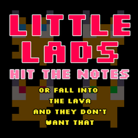
-Reworking a better-looking cover image. In this case one that is more fitting of the game's retro/cartridge aesthetic. I looked at examples of other retro games for inspiration.
-The game used to open in full-screen, I changed this to help reduce eye strain for players as the game is very bright/colorful.
-Rewording description. Making sure to include some parts in-character for the game's thematic.
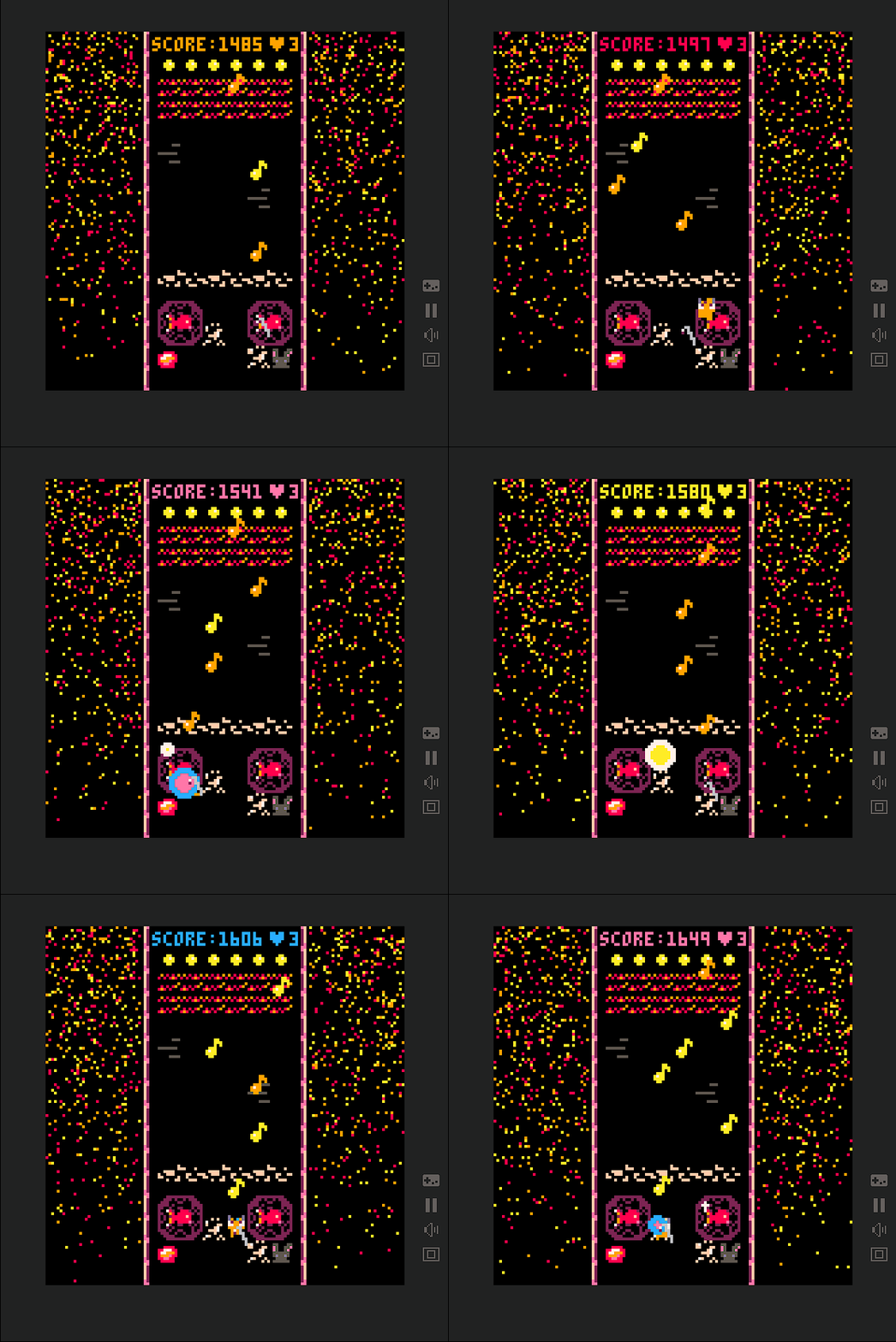
-Adding a small gameplay GIF to hopefully aid in understanding.
-Adding cover image to the "game start" window Itch.io provides.
Get Little Lads Hit the Notes (or fall into lava and they don't want that)
Download NowName your own price
Little Lads Hit the Notes (or fall into lava and they don't want that)
A game of lads that are lil'
| Status | Released |
| Publisher | |
| Author | Carbon-Based Games |
| Genre | Rhythm, Action |
| Tags | 2D, Arcade, Cute, Ludum Dare 55, Pixel Art, Retro, Short, Singleplayer, Top-Down |
| Languages | English |
| Accessibility | High-contrast, One button, Textless |
Leave a comment
Log in with itch.io to leave a comment.